All content (including text, photographs, and design work) is © Shelly Kuck.
My original artwork is for personal inspiration only and may not be copied for publication or contest submission.
Enjoy your Visit!

Slideshow

Thursday, January 31, 2008

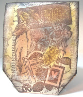
If Tim Holtz sold Toothbrushes

If Tim Holtz sold toothbrushes, I would buy them. If he sold toilet paper, I would buy it too.
I love distress inks because you can acheive so many wonderful looks with them. I sponged Tea Dye ink on the edges of my dictionary page and then used a piece of toilet paper that was dipped in water to get the ink to "wick" on the edges of my layer. The sheet will curl as it dries, but a warm iron will smooth it right out. I
have to confess that my iron is only used for craft projects. Good use of it I say! The toothbrushes come in for swiping ink on the edges of my tags, music and DP layer. I love the distressed and scratchy look I get with them. Don't email me, I now have toothbrushes dedicated to brown and black inks and am no longer using DH's toothbrush. I have had many concerned about his teeth in the past.... The Eiffel tower was embossed with detail black EP and the postmark was stamped in TH walnut stain ink and dabbed with wet TP as well. I hope you like the look.....

Wednesday, January 30, 2008

And the winner is............

Random.org chose Michelle Adams
(aka shellapoo on Splitcoast)
as the Rubbernecker Bucks Blog Candy!
eMail me to claim your loot Michelle.
Congratulations!!!!!

Tuesday, January 29, 2008

Heated Blooms


I had to do another card
for today's color challenge.
All stamps are by
The silk dogwood blooms were
stamped with Yo Yo Yellow
Craft ink, layered and secured
with a large office brad. Using
a long tweezers, heat the blooms
with a heat gun making sure to
move it until the desired effect
is acheived. I did the same with
the leaves and just held them
down with the tweezers. The
lg. brad was removed and replaced with SU! fire brads. The baroque background was used on the flowers and the lower portion of the Going Grey layer. The Basic Gray layer was stamped with white craft using French Letter background. The sentiment was stamped in black and embossed with detail clear EP. I sponged the edge of the going grey layer with Tim Holtz scattered straw distress ink. The flowers were attached with dimensionals.

Moonchild

Be sure to scroll down to the Blog Candy post and answer my question to be entered in a random drawing for Rubbernecker Bucks!

Today's color challenge was to use Basic Gray, Going Gray and YoYo
Yellow. I was not feeling inspired by the colors until I finished my 2nd cup of coffee.
Then, I remembered this awesome from Rubbernecker Stamp Co. It's in the Stamp Oasis section under Celtic Goddess. I stampe her in Versafine Onyx Black and then cut out using an oval coluzzle template taking care to not cut through the bottom star. The moon was stamped on scrap CS, colored and mounted over the top after coloring the image on the oval. Edges are sponged using Tim Holtz Distress ink/Scattered Straw and Classic SU! Basic Gray. The stars are a Cuttlebug die cut. I used a marker to omit part of the outside sentiment and positioned it using a Stamp a Ma Jig. The image is colored with Copic's and the stars
and moon were highlighted with a Sakura yellow glaze pen and sprinkled with Sun Sparkle glitter.

The inside sentiment is also from Rubbernecker as seen here.


Blog Candy!

I am giving away blog candy, really good blog candy. All you have to do to claim the candy is leave me a comment and tell me what your favorite season is. I love warm weather, even hot weather, but Fall is probably my favorite season. Wouldn't you love to have $10 to get some awesome Rubbernecker or Stamp Oasis stamps?


OH!, there are two other design team members giving away blog candy today as well.


Check out their links.

Jeanne S/Inky paws

Bad Sherry/Walkin' on the Bad Side


Leave your comment by midnight Tuesday and I will announce the randomly picked winner by noon on Wednesday, the 30th. Good Luck!!!
Ahoy ye Matey!


It's TREASURE HUNT TUESDAY @ RUBBERNECKER. The Treasure if you find it, will be a free image. However, to receive the Treasure a purchase of any size is required, and your treasure must be claimed between 5:00 am PST until 9:00 pm PST today (8:00 am EST - 12:00 am EST). Not only is today Treasure Hunt Day, but for every $50 in stamps purchased, you will receive one FREE stamp. You can check out more information on the Rubbernecker Home Page. The first clue in this weeks Treasure Hunt can be found in the Stamp Oasis/People section.

While you are on the Rubbernecker Homepage make sure and read about the Rubbernecker Bucks Monthly Drawing AND the FREE stamp offer:
*** Each month you can qualify to win $100 coupon good for Rubbernecker or Stamp Oasis stamps! For every $20 you spend, your name is entered once into a drawing.
*** For every $50 you spend on Rubbernecker, Stamp Oasis or KK Originals stamps, you get to choose a FREE stamp!
We also have some Rubber Buck Gift Certificates to give away as Blog Candy!!! These are redeemable for any stamps in the Rubbernecker or Stamp Oasis sections!

This week's Blog Candy links:
Me, be sure to scroll up to the Blog Candy post and answer my question.

Monday, January 28, 2008

Bookmarks!

Check back for details on Rubbernecker Blog Candy
and Treasure Hunt Tuesday!

The bookmarks measure approximately 2 1/4" x 7" finished size. I started out with Shipping tags that measure 4 /34" x 2 3/8", stamped the Spirit of winter, spring, Summer & Autumn using a Stamp a Ma Jig and then trimmed them down. Cardstock is all SU! and the colors besides black for the base are: Winter/Bordering Blue, Not Quite Navy & Bashful Blue. Spring/Old Olive, Garden Green & Certainly Celery. Summer/Rose Red, Bravo Burgandy & Pretty in Pink. Autumn/Pumpkin Pie, Really Rust& Blush Blossom.
The images were colored with Tim Holtz Distress inks using sponges and cotton swabs.
I also supplemented the coloring with copic markers for highlights and a white gel pen. Stick on Gems were added to the sesson symbols at the top, eyelets and charms at the bottom.
The sentiments are all available from Rubbernecker Stamp Company in the Stamp Oasis section.
Stamps include: Spirit of Winter 483SO
Spring 480SO Summer 481SO & Autumn 482SO. Petite Word Set (10) 2000SO,
French Letter 11SO GM & Music Background 543SO.


Postage Heart Hymn

Check back for Blog Candy and Treasure Hunt Tuesday clue late Monday night or early Tuesday morning!

I stamped the postage heart 1679SO on a piece of white cardstock. Then, I stamped it on Really Rust, Blush Blossom, Perfect Plum, So Saffron, Bordering Blue, Close to Cocoa, Pale Plum and Mellow Moss, I tore each stamp out and affixed them over the top of the heart stamped on white. (see both photos below) After that, I tore around the edge of the layers and this left touches of the vanilla cardstock edge showing. I swiped Tim Holtz Distress in (Old Paper) across my collage and sponged the edges with TH Walnut Stain. The key is grungeboard (harlequin elements) also available from Rubbernecker Stamp Co. I smooshed the key into a versamark pad, and embossed with ultra thick gold embossing powder. While it was still hot, I inked up a sentiment stamp with stazon black and smooshed it onto the key. The rubber will stick until the powder cools, but is easily removed in a matter of a minute or so. The music layer is a page out of a 1932 Pilgrim Hymnal I picked up for 50 cents at a resale shop. I swiped it with TH old paper ink as well. The pale plum base was stamped with a Music BG also available from Rubbernecker in the Stamp Oasis section 543SO. The card edges were swiped with an old toothbrush and Versafine Vintage Sepia ink. The love is from Petite Word Set 2000SO. Oh! the cool filligree corner thing was sent to me by mitchygitchygoomy on Splitcoaststampers. This seemed like the perfect project for something I have been hoarding.
Here is the image stamped in black and the pieced colors over the top.

Close up of key detail, click for larger view.

Parisian Dreamer

This started out as tag art and ended up being a card. The womans face and eiffel tower were stamped with stazon black on polished stone backgrounds. The face background uses Close to Cocoa, Creamy Caramel and Encore Gold ink. The Eiffel background is Not Quite Navy, Creamy Caramel and Encore Gold. The postmark was done using the faux metal technique. The resources section on Splitcoast Stampers has excellent tutorials on these techniques. I have provided 2 photos of the collage background so you have a better idea of how it was created. I started with a
4 1/4" x 5 1/2" piece of Georgia Pacific white cardstock as my base for the collage. Postage Heart stamp by Stamp Oasis was inked with VersaFine Vintage Sepia and rolled in Onyx Black before stamping on a sheet of parchment paper. Images were torn into smaller pieces and affixed to the GP base overlapping them. I made sure that all edges that would show were torn. The base was run through my Xyron with an adhesive cartridge making it easy to just stick all the images down. I did use my ATG gun under some of the overlapping edges. Make sure that all images hang off the edges of the GP base. Flip the collage over and trim one edge with a scissors so you have a straight edge. Then, trim the other sides down using a paper cutter so the edges are straight and the finished size is 4 x 5 1/4". Next, sponge edges with Tim Holtz Walnut Stain distress ink and swipe Scattered straw across some areas. I used a sponge to add TH Faded Jeans. The definition was punched w/ SU! word window punch from a crossword dictionary and layered on a Mcgill word tags punch and a cotton swab was used to highlight some words using Scattered Straw ink. Add brads and assemble the card mounting it on a Not Quite Navy A2 card base. All stamps are by Rubbernecker Stamp Co. Be sure to check back here tonight or early tomorrow morning for details on Treasure Hunt Tuesdays, Rubbernecker Bucks and Blog Candy!

Saturday, January 26, 2008

Tour Eiffel

I just got new images from Rubbernecker Stamp Co. and had to play. All images can be purchased from Rubbernecker in the Stamp Oasis section and the Rubbernecker categories. I stamped the eiffel tower on parchment paper and matted it on Basic Black cardstock. The tour eiffel postmark was also stamped on parchment, cut out and mounted on a 1" circle with a page pebble over the top. I inked up the Spirit of Spring lady eliminating the border and masked off to stamp the background. The butterfly and postmark in the corner are from the postage heart found in the Stamp Oasis section and were affixed to the shipping tag after it was stamped with the French Letter stamp. The tag and images were colored with Tim Holtz Distress inks using a cotton swab and blending with my finger tip. I used the punch from my Carl comb binder to make the holes along the edge of the shipping tag to lace the Basic Grey crushed velvet on the edge. The blush seam binding is Martha Stewart and the fibers are retired SU! The tag is on dimensionals and mounted on The Paper Studio DP. The edges were swiped with a toothbrush and black pigment ink. Lots of Distress inks were used on this card in addition to VersaFine black and brown. Here is the listing: Close to Cocoa Marker, Versafine Onyx Black, Versafine Vintage Sepia, Tim Holtz Distress Inks, Weathered Wood, Scattered Straw, Shabby Shutters, Peeled Paint, Tattered Rose, Aged Mahogany, Vintage Photo

Friday, January 25, 2008

Leftover Art


Todays Limited Supply challenge on Splitcoaststampers was to use leftovers for our cards. I had stamped a bunch of collage images (all available from Rubbernecker Stamp co.) yesterday, so the challenge was perfect for me. I also used a remnant of black fiber and a recycled gold cord from a Christmas gift tag. The images were inked in sepia ink and the rock n rolled in onyx black and punched with a 1 1/4" square punch. To get your tiles even, cut your base about the size of your folded card (basic black) Start in the top left corner and glue down the first square leaving an even amount of the edge on the top and left side. Now, work across the top with the remaining 3 squares, then work down on the left with the other 2. This will give you a guideline to fill in the rest of the squares. I then trimmed the right side and bottom on my Tonic paper cutter. I love this cutter for shaving off small amounts evenly without leaving a rough edge. The black tile layer was then matted on a leftover piece of brushed gold CS that was clear embossed with a floral background. It just shows a little around the edges and I loved using a leftover piece rather than cutting into a new sheet. The embossed tag is by K&Company and the typewriter keys are by Rebecca Sower. Be sure to click on the title above to check out the awesome stamps at Rubbernecker in the RN and Stamp Oasis sections. For a full listing and item numbers, see the description in my gallery at Splitcoast. (papermoon04)

Thursday, January 24, 2008

Pocket Card

I found this neat pocket template in the Dec/Jan issue of the Stampers Sampler magazine. The template can be found Here All stamps used are from Rubbernecker Stamp co. Click on the title to check out their awesome stamps and accessories. The hinge is Tim Holtz grungeboard which you can probably tell is a new fascination of mine right now. I am also loving Tim Holtz distress inks, they lend themselves to collage work so well. The sentiment is embossed in black EP. Images were all inked up with VersaFine Vintage Sepia and then rock n rolled in Onyx Black. The scrolls on either side of the column and the one under the brad are stickers by American Traditional Designs. The fibers are tied through a hook and eye rescued from my sewing stash. The eye is on the bottom portion of the pocket and secured with 2 brads. The hook is glued under a portion of the decorative brad and I just tied a bow after looping it through the hook.


Back of pocket and inside

Wednesday, January 23, 2008

Grungeboard


OK, here I am again today. But, I have gotten a bunch of questions about grungeboard so I thought I would just make yet another post.
Grungeboard is awesome. Unlike chipboard, it stays flexible, is easy to color and distress, and seems to be a bit thinner. I have to say that I love this stuff. I only have one set of the Tim Holtz stuff so far ( harlequin elements) but it is so worth the money. You get 94 die cut images for around $8, but you could use the excess betweeen the cuts to use with you own dies. The grungeboard smells and feels like leather, so cool! It takes ink and distressing like a dream. You really NEED some of this stuff! (can you tell I am hooked?) You can click on the Grungeboard heading to link to the Rubbernecker site to find the other grungeboard sets offered.

Time is a Healer


I love doing collage and this worked perfect with Roxi's sketch challenge today!

All images are available from Rubbernecker Stamp Company. Just click on the title above to check the site out.

I inked up the stamp with Versafine vintage sepia ink and then rock n rolled it in onyx black and stamped on Paper Studio script DP. It was then cut into 3 equal sections and I used a tag corner punch to create the 3 seperate tags. They are mounted on black cardstock and sponged with Tim Holtz distress inks. The sentiment was also stamped on the script dp with VersaMark and I sprinkled black and brown embossing powder on it to get the variegated look. The words are sponged with TH scattered straw ink. The cool hinge is also by Tim Holtz and is grunge board from the harlequin elements collection. The grunge board is more pliable than chipboard, has a neat texture and can be distressed to your liking. I sponged it with TH tea dye ink and soot black. The grunge board is also offered by Rubbernecker and is a steal at $8 for 94 shapes! I also distressed the edges of my sentiment panel and the script layer on my card base using a toothbrush and versafine onyx black ink. The charms were dragged across my black Stazon pad to take some of the sheen off them.

I do a weekly challenge with a group of friends and we take turns selecting somebody who needs a lift to send cards to each week. There is usually an added twist. It was StampingQueenJAR/Judy's turn this week and she threw in a big twist! We needed to not only case a card from one of the other RCAK players, but their style of stamping. The recipient this week is the Mother of Maddy Mason's best friend and she is turning 89 soon and is blind. That means our card also had to have tactile elements so Ruth can feel the card. I did my best to add as many textures as possible for her to enjoy her card. Hope she enjoys it!

Chocolate Moose and Peep

Here's another sneak peek of one of the Riley stamps that will be released on February 1st.

The card front has a flip corner as shown in the smaller photos. The card base is a standard A2 size. Make a 2" square out of scrap cardstock and place in the upper right hand corner of the card front. Make a light pencil line from the top left edge down to the bottom left corner of the square and then over to the bottom right edge of the square. (sort of like forming an L) Remove the scrap and open the card up. Place it in a Fiskars type personal cutter (or use an exacto knife and straight edge) and cut on the pencil line making sure to leave 1/4" on each end so the square is not totally cut off the card front. Now, take the bottom left point of the cut and turn it in and up towards the inside of the card. I layered a 2" square in Pretty in Pink on top of my flip corner, then my image layer. The inside had a square of the same DP as the outside and I will stamp something there as well.

Tuesday, January 22, 2008

Riley Sneak Peek


Here's another sneak peek at Riley the Moose. He will be released by Hanna Stamps! on February 1st. Isn't he irresistable? Riley will come in a set of 6 stamps. Click on the title above to check out the Hanna Stamps forum for details about a kickoff party with activities and giveaways on Friday night 8-11 est.
Now for the card. I used a 5 1/2" square piece of double sided DP. Fold all points into the center forming a smaller square. Then, fold the points back out so the points overlap the fold. I put foam tape under the diagonal corners inside the fold and under each flap. The finished card measures 5 1/2" square.

Monday, January 21, 2008

Visions of Time


So, here I am building my Blog again. I have been asked to Guest Design for Rubbernecker Stamp Co. and here is one of the cards I have created. Collage is one of my favorite styles and I am loving the quality of Rubbernecker's stamps and the images. Check back for more details about Treasure Hunt Tuesdays, Rubbernecker Bucks and Blog Candy!

Blogging Again!

I am working on getting my blog up and running again, check back soon!