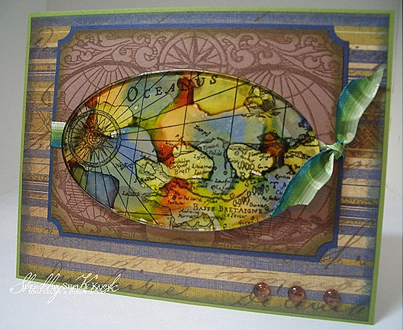
Today's Rubbernecker Blogger Challenge is to use the colors Blue/Green/Brown. Stop on over to the
Rubbernecker Blog and play along with us!
I happened across a piece of DP in my stash and was inspired to use it with the Rubbernecker Map Background
and World Postcard stamps. Both are in the Old World section under the Rubbernecker category. The oval fragment is one of the new
Tim Holtz ovals & circles collection. I used alcohol inks in Caramel/Denim/Lettuce and let it dry. The map background was stamped
in Versafine onyx black on natural ivory CS and then I adhered the fragment to the image using Glassy Accents as my glue. It dries
very quickly and you can use a scissors to trim closely around the fragment right away. I layered it on a cocoa scrap that
was stamped with the world postcard background in Versafine vintage sepia ink. The edges were punched with a ticket
corner and sponged with Distress Peeled paint and then layered on navy CS. The K&co. awning strip DP is sponged with
Distress Faded jeans and layered on Olive CS. I added ribbon and Dew Drops for my accents. Check out what the other
Rubbernecker designers have done for the challenge:
Bev - Savor the Journey
Candy - Candys Land
Jules - Stampin with Inky Fingers
Kittie - Kittie Kraft
Linda - Linda’s Works of Heart
Tami - A Walk on the Mild Side
Sherry - Walkin' on the BAD Side!


Ahhhhhhhhhhhhhhhh!
ReplyDeleteWhat a fabulous project, Shelly! I love it! And surprisingly .. I DID get a Blue-Brown-Green challenge done ... I'm as surprised as you! hahahah
Fabulous as always, my friend!
~Bev
WOW!!
ReplyDeleteThat oval fragment is amazing!!!!
I love the way you used the three colors! Beautiful!
This is stunning!!! Wow!
ReplyDeleteOh my, this is just amazing!!!
ReplyDeleteShelly, Your projects are gorgeous. I especially love that workd map. Your coloring is spectacular.
ReplyDeleteWow! The vintage look and the color too! I really like how you did the map and the Dew Drops worked out perfect to bring attention back to the main image again! Lovely!
ReplyDeleteThis is stunning! The fragment jumps right off the page! I love the map images too. Great card!
ReplyDeleteWhat an amazing card!
ReplyDeleteOH, WOW!!! That looks amazing, Shelly!
ReplyDelete